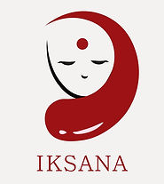
IKSANA | 360° PROMOTIONAL DESIGN
About the project:
For many of us, menstruation is a normal process that occurs every month, and while we might suffer from minor annoyances such as pain and discomfort, it doesn’t usually have an impact on our personal and professional development. The same is not the case for everyone. The rural part of India and its women are in massive need of effective, affordable sanitary napkins, apart from the very obvious need for education.
This project is about creating a brand and a 360° ad campaign targetting the need for healthy menstrual practices in rural India.
Brand Created:
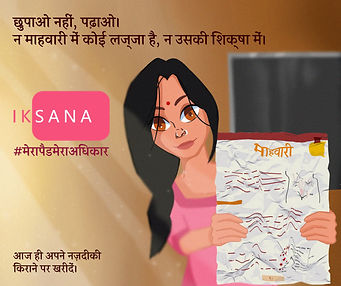
Brand Name: IKSANA (sanskrit word; ईक्षण)
Meaning: caring for/ taking care of
FINAL LOGO:
B & W:

Coloured:

Final Colour Palette:
Final Campaign:
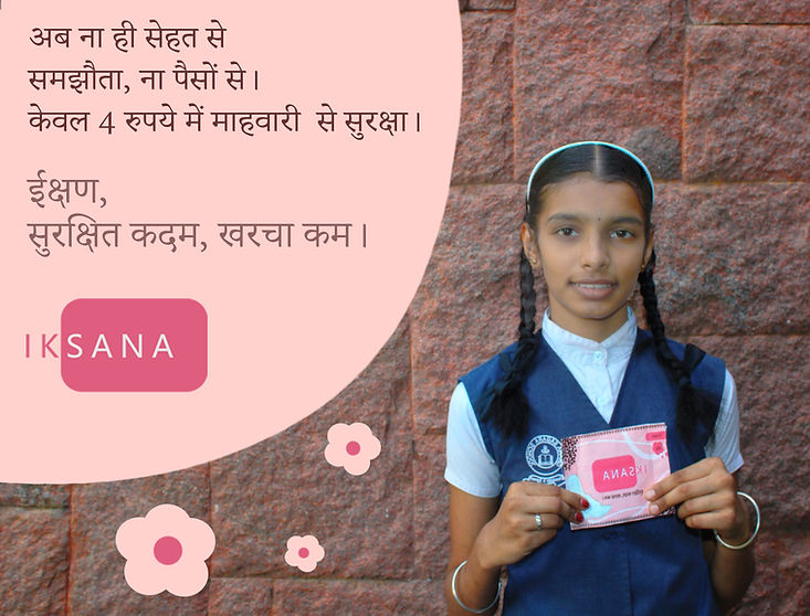
USP: Affordability
Tagline: Surakshit kadam, Kharcha kam.
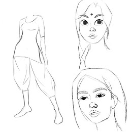
Target Audience: Rural women, 14 to 25 yrs of age
Since most rural families in India find it extremely difficult to make even basic ends meet and girls aren’t able to have access to pads due to financial issues, we decided to focus on selling our brand by focussing on it’s factor of affordability. We decided to make a video ad which is simple, but directly connects to the needs of the rural women and what is holding them back.
Also, since a lot of brands focus on breaking taboos, this will make our brand stand different from others. Women aren’t able to afford pads even if their families and communities allow it, and that’s what we focussed on.
Ad Collaterals:
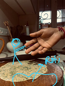
IKSANA VIDEO AD:

BRANDING AD:


PRINT ADS:

SOCIAL MEDIA AD:

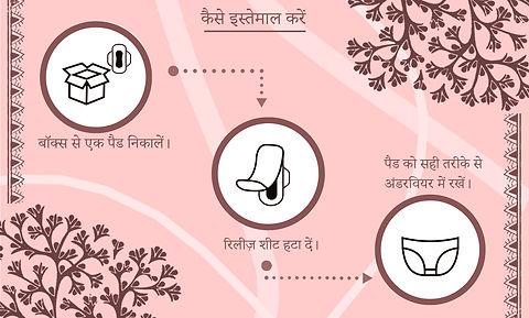
Product Packaging:
SINGLE PAD:

16 PADS BOX:
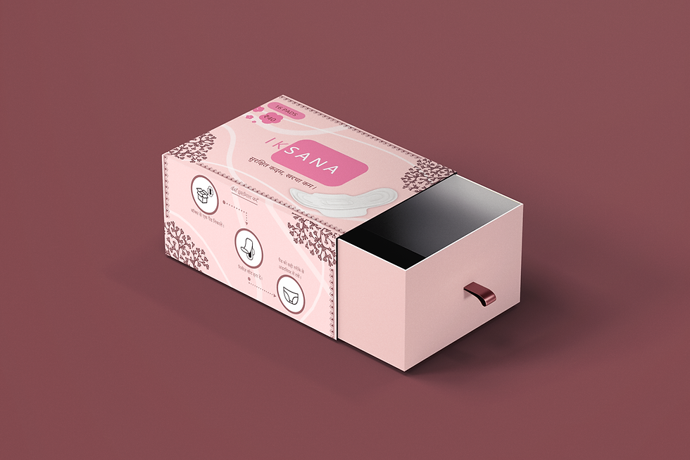
BOX TOP AND BACK:


BOX SIDES:

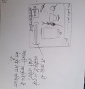
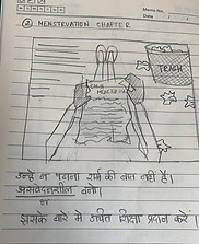
Initial Campaigns and Ideations:


.jpeg)